


Designing a fresh brand identity and intuitive eCommerce interface for hobby gardening enthusiasts.
Logo / Visual Identity / UX/UI web / Packing

2020
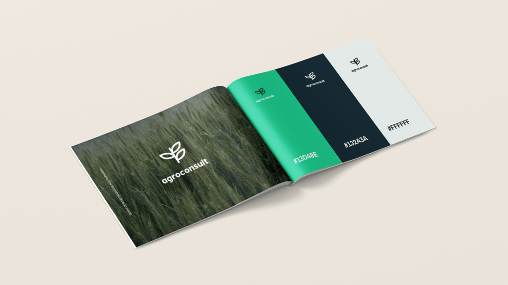
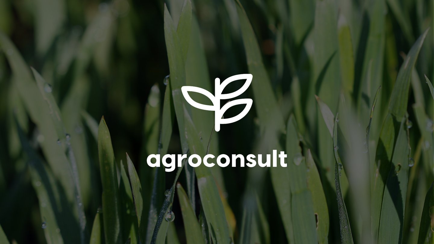
BRAND IDENTITY
AGROCONSULT
Sustainable Agrochemistry
LITHUANIA
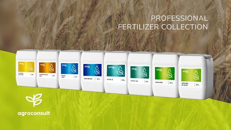
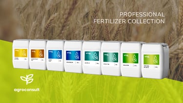
FERTILISERS
2020 / 1 MONTH
A holistic design system that connects branding, packaging, and UX/UI into one consistent and engaging gardening experience.
Most gardening brands in the EU market rely on traditional, earthy aesthetics that often feel outdated and uninspiring for younger, urban audiences. The task was to design a vibrant, human-centred brand identity and eCommerce experience that could transform hobby gardening into a playful, modern lifestyle ritual. The challenge was to balance clarity and usability in UX/UI with a colourful, emotional visual language that speaks to both functionality and inspiration.
DESIGN SOLUTION
DESIGN CHALLANGE
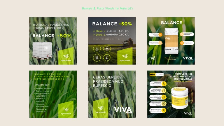
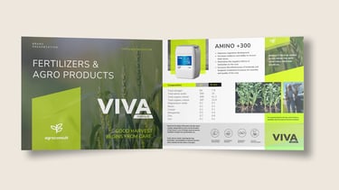
We built Viva Fertis from the ground up — from logo and packaging design to a full UX/UI journey. The brand identity blooms with fresh, contrasting colors (mint, orchid, rose, peach, lemon), moving away from “muddy” tones of traditional gardening. Rounded typography, airy layouts, and hand-drawn accents convey a sense of friendliness and modern joy, while the geometric logo reflects growth and balance.
On the eCommerce side, clarity and confidence were prioritised: large, clean product images let the packaging shine, while essential information is grouped above the fold for effortless scanning. Minimalist selectors, bold CTAs, and light, playful details make the shopping flow seamless and engaging. Together, these elements position Viva Fertis not just as a shop, but as a vibrant digital space where products, inspiration, and plant care merge into an uplifting lifestyle experience.
02.


03.
01.
Logotype design uplift:
before:
after:
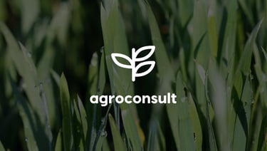
The logo modernization applied the core principles of brand uplift: simplification, versatility, modern typography, and a symbol that communicates growth and harmony with nature. This is especially fitting for a fertilizer company, as it emphasizes a contemporary agricultural direction – innovative, reliable, and sustainable.
The old logo was colorful, with a more complex structure – bright green and blue tones, a geometric square, a leaf symbol, and a technical, somewhat outdated typeface. This design visually resembled the aesthetics of the 2000s, carrying a sense of technical coldness and not fully conveying reliability or modernity.
The new logo has been simplified to an essential, universal symbol – a stylized plant sprout. The black-and-white color palette adds solidity, professionalism, and modernity – making the mark universally adaptable across various formats (from packaging to digital media). The typography has been replaced with a low, rounded sans-serif typeface that feels friendlier, stronger, and clearer. The new mark resembles a “global brand” level identity – minimalist yet highly recognizable.
04.

05.
06.
07.


08.
09.