


Full Brand Redesign, Positioning & Marketing Strategy
Positioning & Strategy / Logo / Visual Identity / UX/UI website / Video & 3D portfolio
2019/2021
FULL SCALE REBRANDING
CONRESTA
Bold and Modern Identity
LITHUANIA
GENERAL CONTRACTOR
2019-2021/ 2 YEARS
The new Conresta brand system and marketing tools positioned the company as a modern, trustworthy, and innovation-driven leader. The rebrand strengthened client confidence, opened opportunities for international communication, and established a long-term platform for strategic growth.
Conresta, one of the largest general contractors in Lithuania, was seeking to modernize its visual communication and strengthen its positioning in a competitive market. The previous identity no longer reflected the company’s innovative approach, technological expertise, and growing international presence.
DESIGN SOLUTION
DESIGN CHALLANGE
We developed a complete brand positioning and marketing strategy, presenting Conresta as an innovative, reliable, and forward-thinking market player.
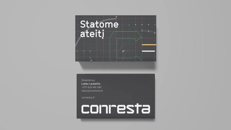
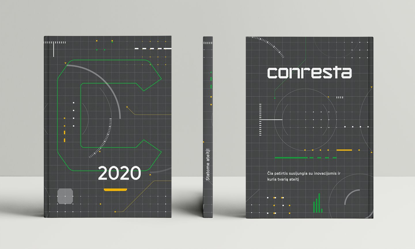
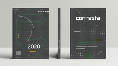
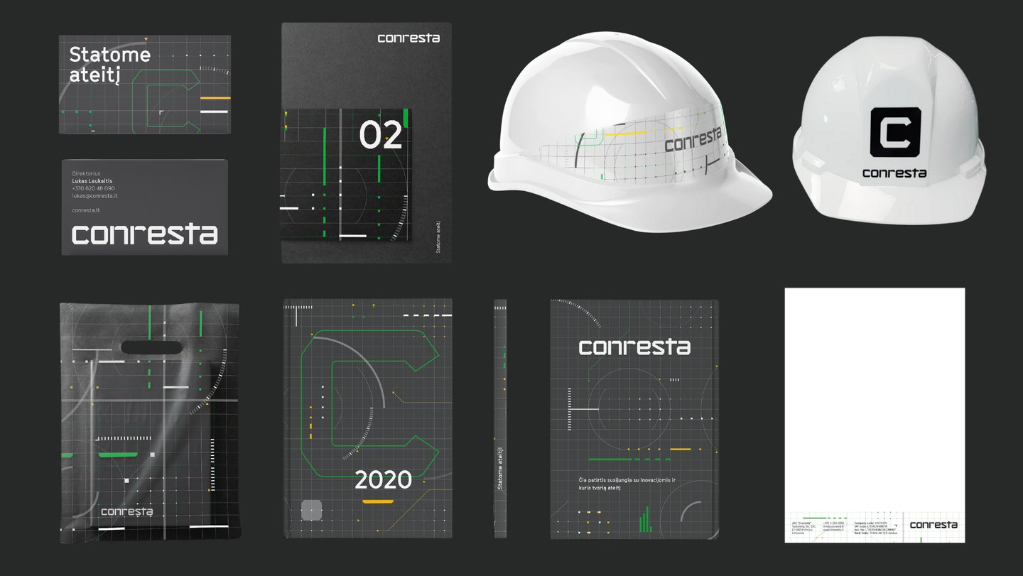
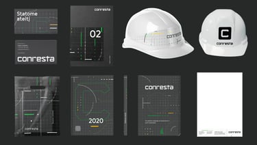
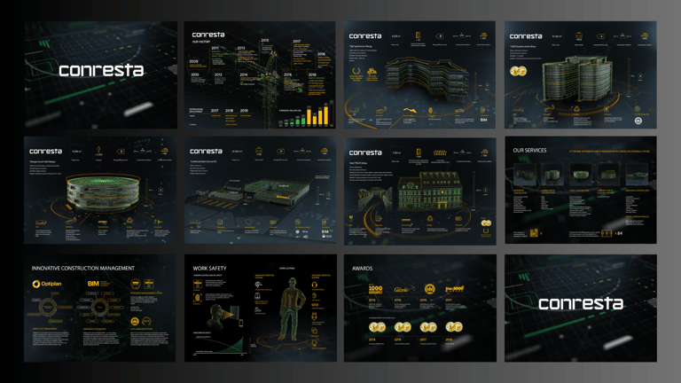
Brand Identity: creation of a brand-new logo, visual identity, and design system applied across digital and physical touchpoints.
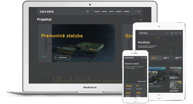
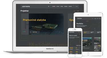
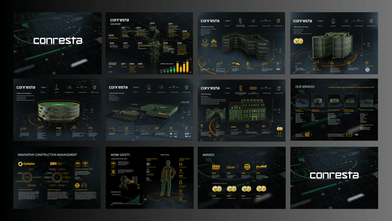
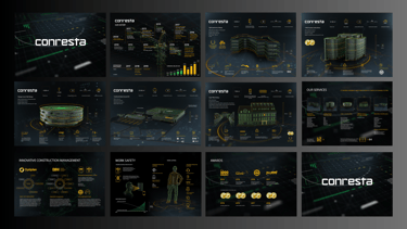
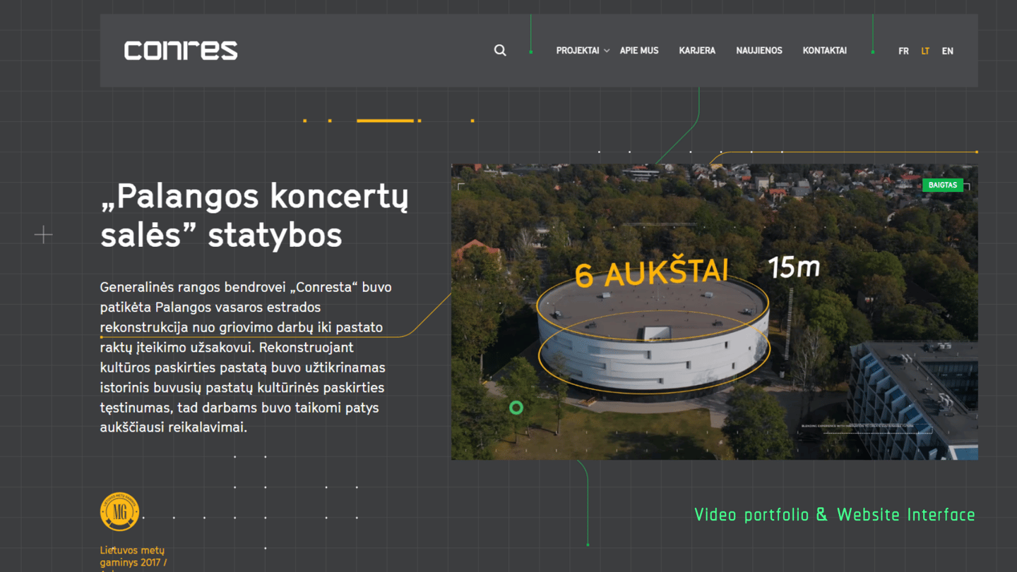
Website: a modern UX/UI design with interactive portfolio filters and structured project showcases.
Video Storytelling: drone-filmed video and narrative showcasing Conresta’s story and focus on innovation.
3D Project Showcase Book: an innovative presentation tool featuring architectural 3D visuals of projects to highlight scale and quality.
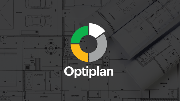
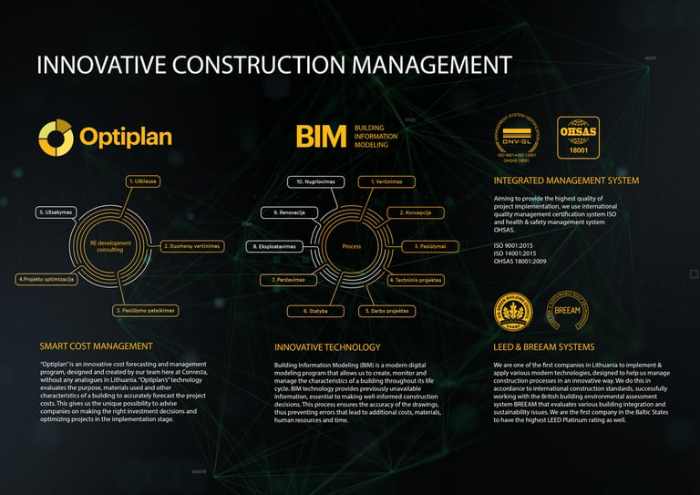
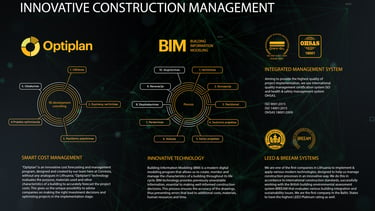
Marketing Strategy: strong focus on Optiplan and BIM communication, emphasizing digital construction, efficiency, and transparency.
02.
03.
01.
04.
Logotype design uplift:


before:
after:
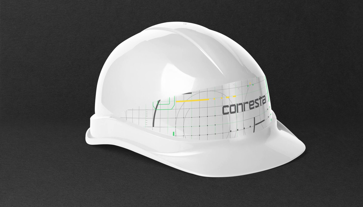
The logo modernization applied the core principles of brand uplift: simplification, uniqueness, modern typography, and a form that reflects structural strength and precision. This is especially fitting for a construction company, as it emphasizes a contemporary direction – innovative, reliable, and internationally oriented.
The old logo combined a geometric “S” symbol in green and dark grey with a rounded, friendly typeface and a descriptive tagline, “General Contractor | Construction.” While this conveyed reliability and professionalism, the overall impression leaned toward a conventional corporate look. It lacked distinctiveness, modern appeal, and the sharper visual language needed to reflect innovation and stand out in the construction industry.
The new logo is a brand-new typographic design, stripped down to its essence. Bold, angular letterforms — inspired by the precision of CNC cutting machines — convey structural strength, innovation, and technological sharpness. This super-modern identity positions Conresta as a confident, internationally oriented player in the construction industry. The new lettering, inspired by the precision of CNC cutting machines, conveys strength, structure, and technological sharpness. This design evolution reflects Conresta’s innovative spirit and positions the company as a contemporary, international player in the construction sector.


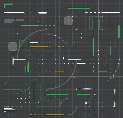

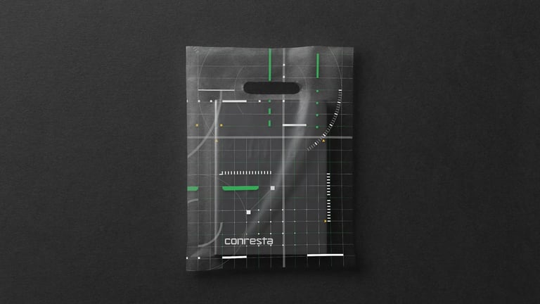
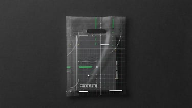
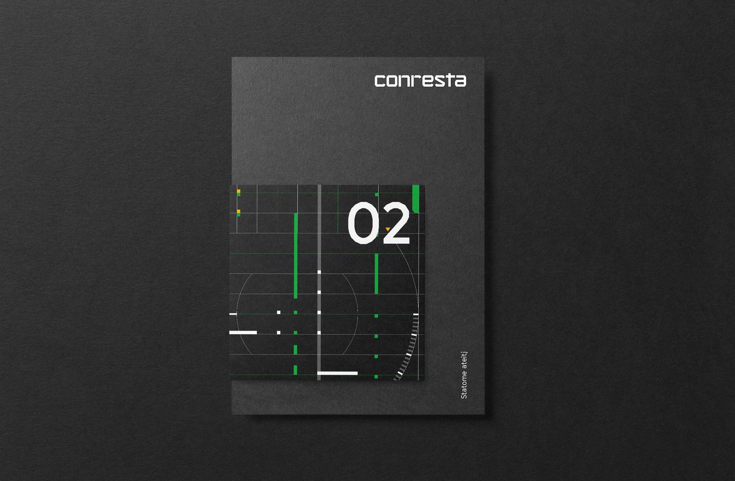
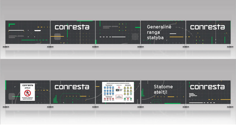
The new graphic system is inspired by the language of architectural drawings and engineering grids. Dynamic lines, modular structures, and layered geometric shapes echo the precision of construction blueprints and CNC patterns. The grid becomes both a functional and aesthetic tool — creating a sense of order, rhythm, and technical sophistication.
This approach not only modernizes the visual style but also ties the brand identity directly to construction expertise and innovation, reinforcing Conresta’s positioning as a forward-looking, internationally oriented company.
Graphic system uplift:
before:
after:
12.

10.
11.
13.
12.
14.
15.
07.
16.
17.