


A complete e-Commerce experience designed for Quattro Super Premium, a high-quality pet food brand entering the Latvian market.
Visual Identity Uplift / UX/UI e-Shop / Packaging
2024
UX/UI Web Design
AB KAUNO GRUDAI
Pet Food eCommerce
LITHUANIA / LATVIA
GARDEN ESSENTIALS BRAND
2024
A holistic design system that connects branding, packaging, and UX/UI into one consistent and engaging gardening experience.


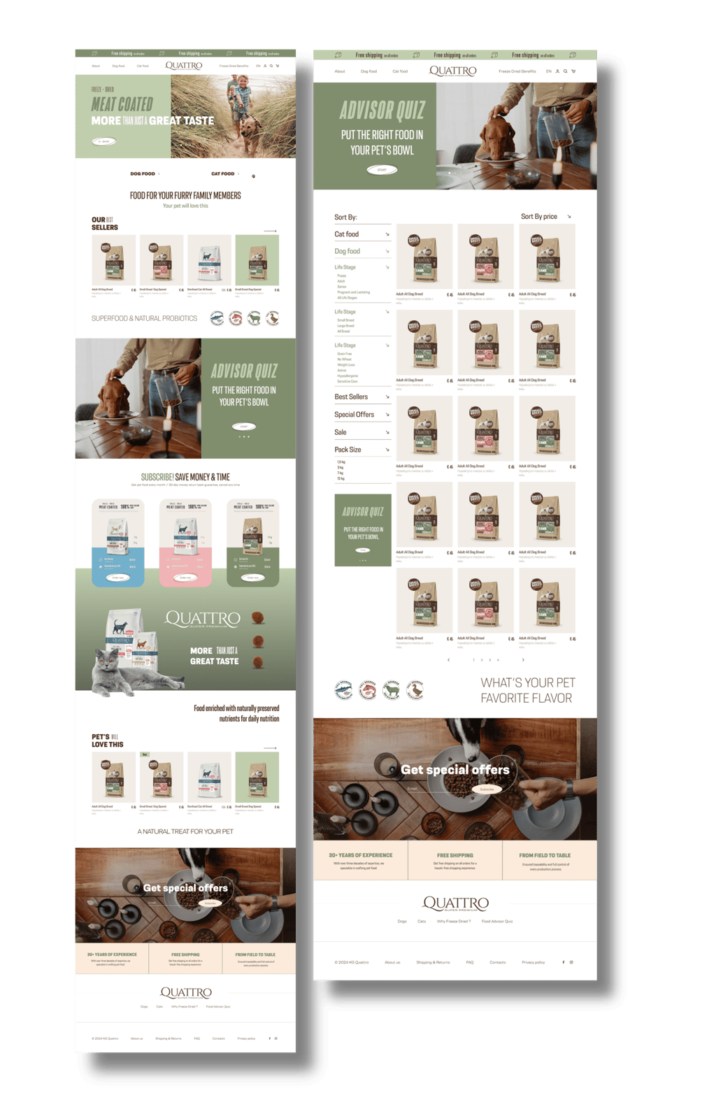
The goal was to craft a visually soothing and emotionally resonant interface that builds trust while gently guiding users toward conversion. The design balances clean navigation and a nurturing tone, making the digital experience feel as caring as the product itself.
The UX strategy puts clarity and empathy first: streamlined product filtering, subscription-based incentives, and a built-in loyalty program that rewards repeat purchases. Users are encouraged to subscribe and stay engaged through thoughtfully placed calls-to-action, progress rewards, and a pet-specific product quiz that tailors recommendations based on individual needs
DESIGN SOLUTION
DESIGN CHALLANGE
Visually, the UI embraces calm earthy tones, soft gradients, and lifestyle imagery, reflecting both the natural integrity of the ingredients and the heartfelt bond between pets and owners. The result is a smooth, trust-centred shopping experience — both functional and emotionally intelligent.
Design Highlights:
– Figma-based modular design system for scalable growth and brand consistency across all touchpoints. The system allows flexible expansion while maintaining a cohesive visual language tailored to the Latvian eCommerce market.
– Optimised product pages with clean visuals, intuitive filters, and easy comparison flows. The design avoids visual clutter while highlighting product benefits, nutritional info, and reviews in a calm, confidence-inspiring layout.

02.
01.
03.


04.
The social media visual identity was designed as a seamless extension of the eCommerce experience, ensuring strong brand consistency across every digital touchpoint.
We developed the complete Instagram grid system, including campaign banners, promotional visuals, product-focused posts, educational content, and reusable layout structures. Colours, typography, graphic elements, photography, and composition were carefully aligned with the eShop’s visual language.
The result is a cohesive digital ecosystem where social media and eCommerce feel like one unified brand — recognisable, consistent, and easy to navigate across platforms.

Social Media Visual Identity
UX/UI DESIGN SYSTEM
Loyalty Program Integration & Design


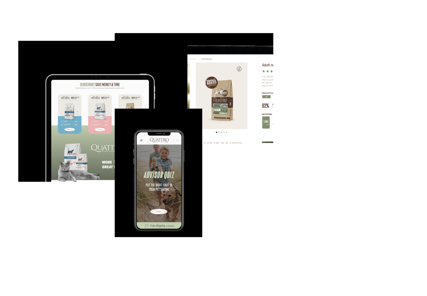
The product page was designed to transform detailed product information into a clear, intuitive and conversion-focused shopping experience while maintaining Quattro’s distinctive visual identity.
The UX prioritises essential purchase information — product imagery, price, ratings, size and flavour options, nutritional highlights and a clear Add to Cart action. Detailed information is organised into expandable sections, keeping the interface clean and easy to navigate.
The page extends beyond the core purchase flow through ingredient storytelling, feeding guidelines, product benefits, related flavours, reviews and subscription options — naturally guiding customers from discovery to purchase and repeat ordering.
Strong visual hierarchy, branded iconography and editorial-style content blocks balance functionality with storytelling, while cross-selling and subscription modules support conversion without interrupting the shopping journey.
The result is a cohesive product experience combining eCommerce functionality, brand storytelling and conversion-driven UX, helping customers understand the product and make confident purchase decisions.
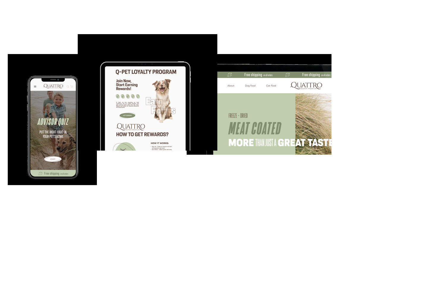
The Q-Pet Loyalty Program was designed as a seamless extension of the Quattro eCommerce experience, transforming customer rewards into a clear, engaging and easy-to-use digital journey.
I designed the complete loyalty experience, from the dedicated landing page and visual communication to the reward structure, points system, calls to action and step-by-step user flow. The challenge was to communicate multiple ways of earning and redeeming points without overwhelming the user, while keeping the experience playful and intuitive.
The visual language was built directly around Quattro’s existing eCommerce identity. Custom pet imagery, illustrated icons, typography, colour palette and graphic elements create a distinctive experience while maintaining full consistency with the wider brand and online store.
Clear information hierarchy and simplified UX guide customers from understanding the program to signing up, earning points and redeeming rewards with minimal friction.
The result is a loyalty experience that feels like a natural part of the Quattro ecosystem, strengthening brand recognition, encouraging repeat purchases and turning customer retention into an engaging brand interaction.


DIGITAL BRAND SYSTEM
Product Page UX/UI Design
05.
06.


08.
The catalogue extends the eCommerce design language into print, creating a consistent brand system across packaging, digital and physical touchpoints.


07.
UX/UI DESIGN SYSTEM
Packaging System & Product Line Design
We developed the packaging system for a five-flavour product range, creating a distinctive yet unified visual language across the entire line. Each flavour features a custom illustration and its own colour identity, turning colour into an intuitive navigation system for fast product recognition.
The result is a cohesive, scalable packaging system that strengthens shelf impact, simplifies flavour differentiation and keeps every product unmistakably Quattro.
Singapore exhibition
Product Line Catalogue Design
The Quattro product catalogue was designed as a menu-inspired brand experience, bringing the complete product portfolio together in one clear and visually engaging format.
Structured like a curated food menu, it allows customers and partners to easily navigate between product lines, flavours and formats. Each product is supported by its key features — ingredients, nutritional benefits, protein source, feeding information and product specifications — creating a comprehensive overview without losing visual clarity.


10.

Physical Brand Experience
Custom Illustration & Brand Merchandise
Building on the visual language developed across packaging, eCommerce and the product catalogue, the Quattro identity was extended into a more expressive lifestyle layer. We created a series of custom “Adventure Portraits” illustrations, bringing together pets, people and everyday adventures in the same playful brand spirit. The illustrations were then translated into T-shirts, mugs and branded merchandise, taking Quattro beyond the product and into real-life customer touchpoints. The result is a brand system that lives consistently across digital, print, packaging and physical experiences.


11.
12.
Pet Experience & Custom Product Design
Branded Cat House
Functional brand experiences for events and exhibitions
Branded Beach Chair


13.
14.
In-Store Brand Experience & Retail Activation
Custom POS Shelf Display
Functional Brand Experience for Events & Exhibitions
Branded Prize Wheel


15.
The Quattro visual system was further extended into physical brand touchpoints and event environments, translating the same graphic language into larger-scale, functional objects. From branded event tents and deck chairs to custom pet houses, each application was designed as part of one cohesive system — carrying the brand’s typography, colour palette, illustrations and playful pet-led storytelling into the physical world. Rather than simply placing a logo on merchandise, each object becomes a recognisable piece of the Quattro brand.
Outdoor Brand Experience & Event Activation
Brandedn Event & Exhibition Tent
16.
Outdoor Brand Experience
Branded Vehicle Design
The Quattro identity was extended into a full vehicle branding system, transforming company cars into moving brand touchpoints. The design brings together product packaging, pet imagery, campaign messaging and the core colour palette while carefully adapting every element to the vehicle’s structure. The result is a recognisable mobile brand presence that carries the same visual language from packaging and eCommerce into retail, events and the physical world.


