UX I UI Web Design
Design with soul. Precision and visual poetry in every pixel. Figma-crafted.
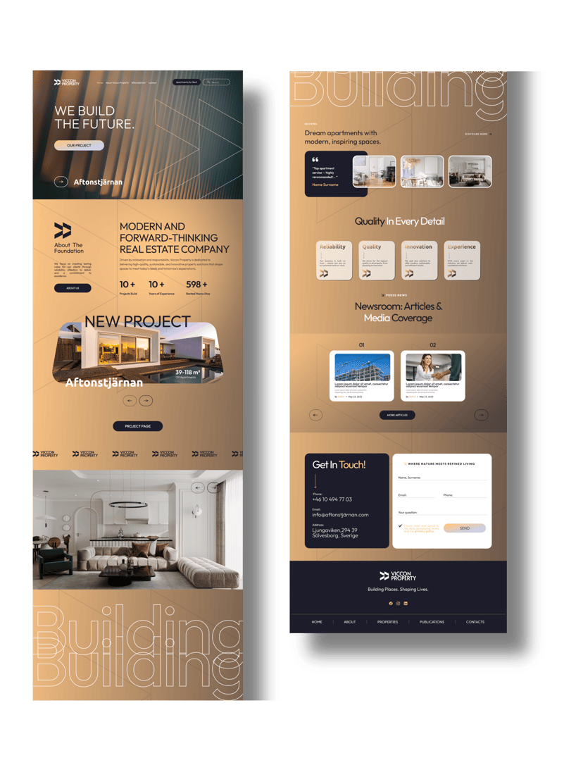
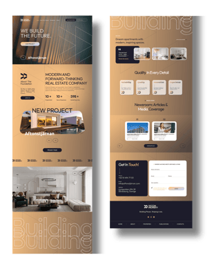
A sophisticated and visually compelling website concept created for a future-focused real estate company in Sweden.
UX/UI Web Design
Key Highlights:
This design seamlessly blends architectural finesse with digital elegance, resulting in a layout that is both aesthetically elevated and intuitively functional. Every detail is crafted to convey trust, quality, and forward momentum — shaping a digital presence as bold and visionary as the buildings it reflects.
– Figma-powered design system: built on a precise grid with reusable, scalable components for design consistency and development efficiency.
– Artfully curated visual identity: rich golden gradients, paired with deep navy tones, create a luxurious and grounded feel, transmitting both innovation and reliability.
– Smart content strategy: a thoughtfully structured information flow tailored to the real estate sector, with strategically placed CTA’s, intuitive navigation, and space for storytelling.
– Elegant typographic system: bold, confident headlines meet soft, geometric detailing — providing clarity, rhythm, and visual hierarchy throughout the interface.
– Responsive layout: ensures seamless experience across devices. Delivers a polished, user-first experience with seamless transitions and optimised readability.
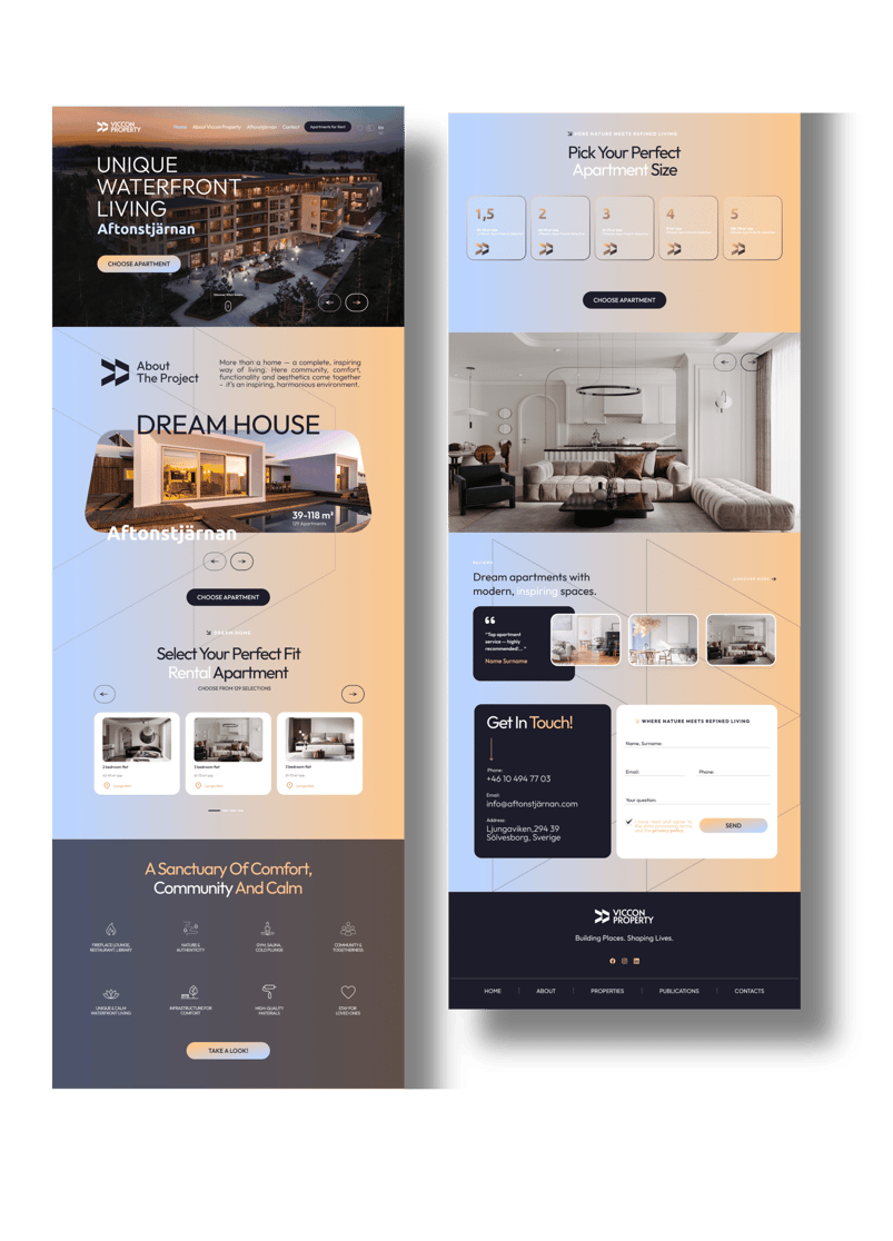
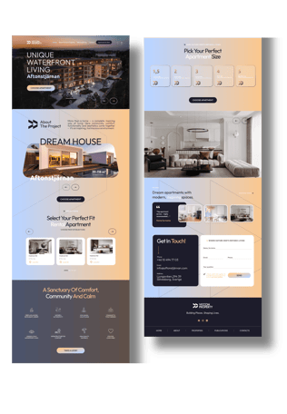
Aftonstjärnan — a refined web extension designed as part of the Viccon Property website ecosystem, dedicated to their rental platform project.
A digital experience designed for Aftonstjärnan — a high-end waterfront residential project in Sweden. This web concept merges clean Scandinavian aesthetics with intuitive, user-friendly UX to guide prospective buyers through a seamless apartment discovery journey.
From the moment you land, the interface radiates tranquility and trust — merging lifestyle storytelling with functional clarity. Warm gradients of soft peach, sand, and morning-sky blue mirror natural light and shoreline calm, grounding the project in emotional elegance.
This design module functions as a seamlessly integrated yet standalone user journey within the broader site, offering a calm, elegant, and conversion-focused UX. Tailored for clarity and emotion, the layout combines intuitive navigation with immersive visuals, enabling future tenants to explore layouts, browse interiors, and take action easily.
Aftonstjärnan - UX/UI Web Design for Premium Waterfront Living
Design Highlights:
Intuitive apartment selector with a visual grid of floor plans and size options — allowing users to filter by number of rooms, square footage, and availability.
Soft scroll-based navigation guides users through sections like “About the Project,” “Apartment Preview,” and “Contact,” mimicking a physical showroom experience.
Interactive 3D preview mockups for apartment layouts enhance clarity, especially for remote buyers or first-time renters.
Content flow bridges emotional storytelling (“dream house,” “a sanctuary of calm”) with practical filters — letting logic and emotion co-exist in the same journey.
Form & CTA sections are minimal, modern, and clearly spaced — with a large footer providing key contact info, form, and brand messaging.
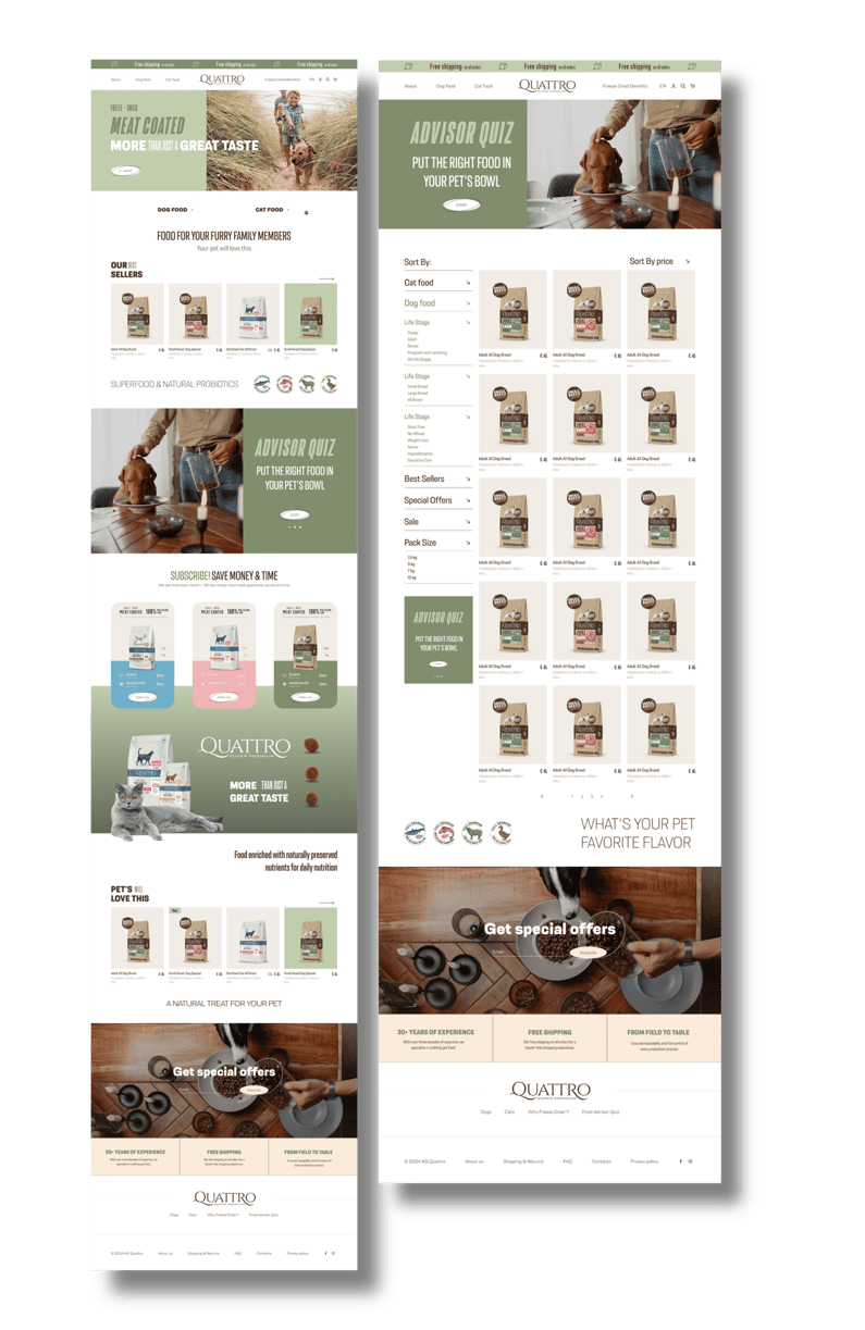
A complete eCommerce experience designed for Quattro Super Premium — a high-quality pet food brand entering the Latvian market.
The goal was to craft a visually soothing and emotionally resonant interface that builds trust while gently guiding users toward conversion. The design balances clean navigation and a nurturing tone, making the digital experience feel as caring as the product itself.
The UX strategy puts clarity and empathy first: streamlined product filtering, subscription-based incentives, and a built-in loyalty program that rewards repeat purchases. Users are encouraged to subscribe and stay engaged through thoughtfully placed calls-to-action, progress rewards, and a pet-specific product quiz that tailors recommendations based on individual needs.
Visually, the UI embraces calm earthy tones, soft gradients, and lifestyle imagery, reflecting both the natural integrity of the ingredients and the heartfelt bond between pets and owners. The result is a smooth, trust-centered shopping experience — both functional and emotionally intelligent.
Quattro — UX/UI eCommerce Design for the Latvian Market
Design Highlights:
– Figma-based modular design system for scalable growth and brand consistency across all touchpoints. The system allows flexible expansion while maintaining a cohesive visual language tailored to the Latvian eCommerce market.
– Advisor Quiz functionality is designed as a friendly, guided experience that mimics a conversation, helping pet owners quickly find the right product while building brand trust through helpful, human-centred UX.
– Loyalty program integration that visually communicates rewards through playful, pet-themed visuals, turning engagement into an emotionally positive experience and encouraging long-term customer retention.
– Optimised product pages with clean visuals, intuitive filters, and easy comparison flows. The design avoids visual clutter while highlighting product benefits, nutritional info, and reviews in a calm, confidence-inspiring layout.
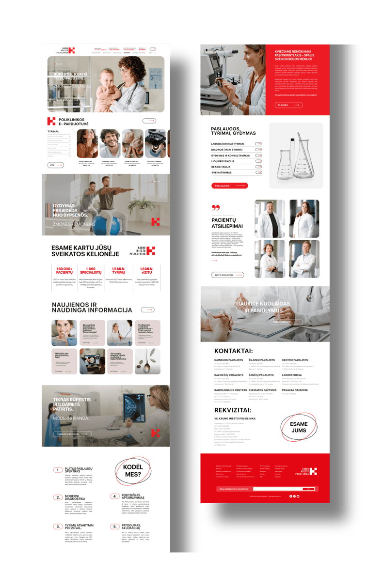
Kaunas City Polyclinic — UX/UI Web Design for Modern Public Healthcare
Design Highlights:
– Emotion-led homepage structure focused on real user goals: appointment booking, doctor search, and test result access.
– Soft UI language and caring imagery create an experience that feels safe, calm, and human.
– Integrated e-shop for ordering medical tests and services, with clear categorization and simplified navigation.
– Strategic color palette using warm neutrals and red highlights to guide attention and reduce cognitive load.
– Accessibility-compliant design, meeting key WCAG 2.1 standards and ensuring inclusive access for users with disabilities.
This is more than just a healthcare website — it’s a digital space of care, designed with people in mind.
A full-scale website redesign created for Kaunas City Polyclinic, one of the largest outpatient healthcare institutions in Lithuania.
This UX/UI solution reimagines a complex healthcare system into a clear, intuitive, and emotionally supportive digital experience, helping patients find services, doctors, and essential health information with ease, empathy, and trust. From first-time visitors to returning patients, every touchpoint is designed to reduce stress, improve navigation, and build confidence in care.


The design’s calm spacing and geometric structure create a soft yet organized aesthetic — offering clarity and emotional ease for future residents. Consistent iconography and refined details bring visual unity across the site, while multilingual and accessibility-ready features ensure an inclusive experience for both local and international users.


Design Highlights:
– Shop experience: minimal yet playful, with intuitive filters and a visual rhythm that makes comparing products feel effortless.
Color-coded product backgrounds help users intuitively navigate the assortment — yellow for flowers, green for trees, peach for soil, purple for lawns, and pink for vegetables. These hues correspond with top menu icons and create an emotional shortcut to category recognition, making the site feel more alive, cohesive, and easy to explore.
– Custom sidebar menu allows dynamic filtering by plant type, features, or usage — designed to feel light, responsive, and human.
– Product pages are built for clarity and confidence: large visuals of packaging, bold price-to-cart CTA, and expandable sections for benefits and application. Seasonal timelines and visual dosage charts make the experience informative for both beginners and pros.
– Layered content integration: blog posts, real user reviews, and Instagram stories bloom organically throughout the site — nurturing trust, discovery, and ongoing engagement.

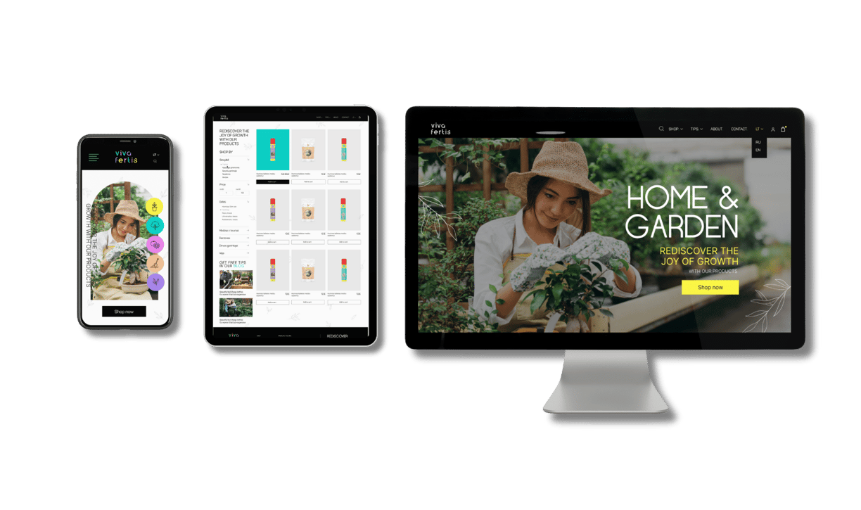

Viva Fertis — UX/UI Design & Visual Identity for Hobby Gardening eCommerce (EU market)
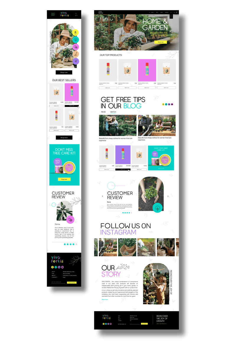
Viva Fertis is a vibrant, feel-good eCommerce concept rooted in the joy of hobby gardening across Europe. From logo & product design to the full UX/UI journey, this project grew from scratch to embody a fresh, colorful, and human-centered approach to plant care. Transforming everyday plant care into a playful digital ritual for curious, creative growers.
Brand identity blooms with bright, contrasting hues — mint, orchid, rose, peach, and lemon — moving away from traditional “muddy” gardening tones. Rounded typefaces, airy layouts, and hand-drawn accents create a friendly, organic feel, while the playful, geometric logo reflects growth, balance, and modern joy. Designed for urban growers and curious green thumbs, the site is more than a shop — it’s a vibrant space where products, tips, and inspiration grow together.
Product Page – UI/UX Focused on Clarity, Confidence & Delight. Each element is placed with intention: the product image is large, clean, and visually centered, allowing the colorful packaging to speak for itself. Key info — product name, size, price, and quick benefits — is grouped above the fold, minimizing cognitive effort and supporting instant scanning. The -50% discount badge, minimalist quantity selector, and bold "Add to Cart" CTA follow best practices for eCommerce flow — while still feeling light and unobtrusive thanks to airy layout and delicate linework.